Windows Phone 8 and Windows Phone 8X by HTC Preview
by Brian Klug on October 29, 2012 2:10 PM EST- Posted in
- Smartphones
- HTC
- Mobile
- windows phone 8
- Windows Phone 8X
- HTC 8X
- WP8
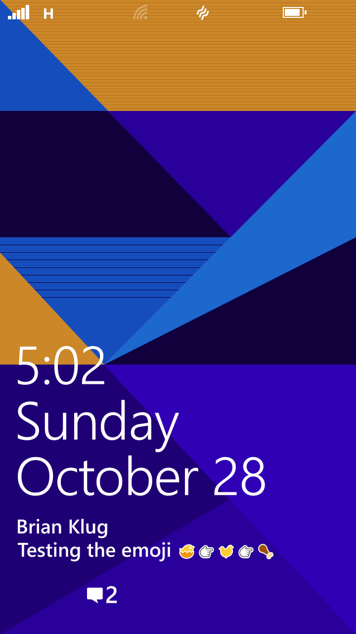
Live Tiles
Probably the largest single readily identifiable change in WP8 is what’s been done with the positioning and layout of live tiles on the start screen. In WP8 there’s no longer an asymmetric layout with black bar at the far right. I’m told that internally this move away from asymmetry was something many felt strongly about since it was a big part of the original metro design language, but at the end of the day increasing the usable space for tiles on the start screen makes sense — after all, you’ve ostensibly paid for those pixels. In addition, shoppers looking at a Windows phone with those unused pixels at the sides were subjectively gauging the display as smaller than other phones on the shelf, even though sometimes they were the same size or larger.
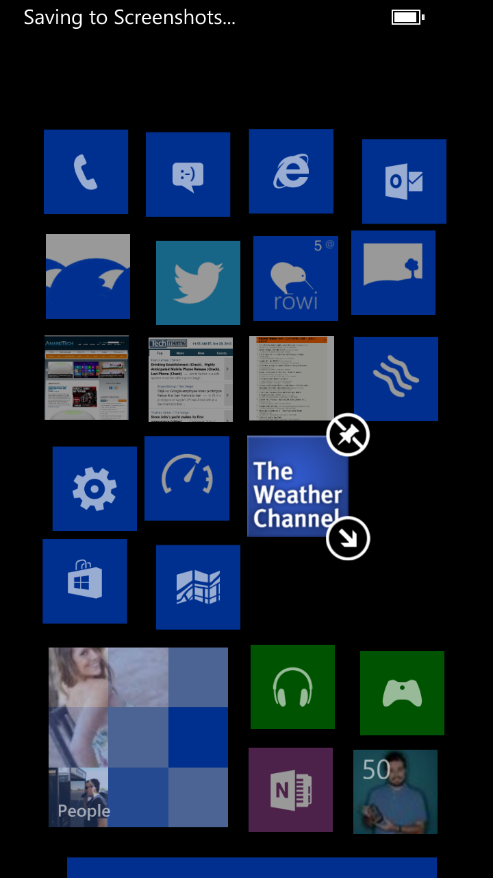
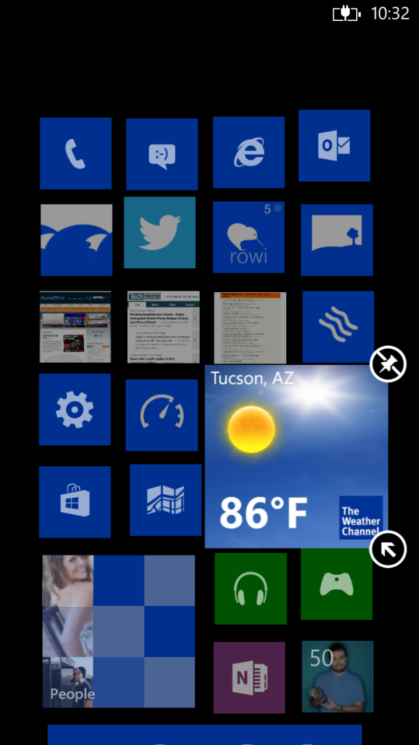
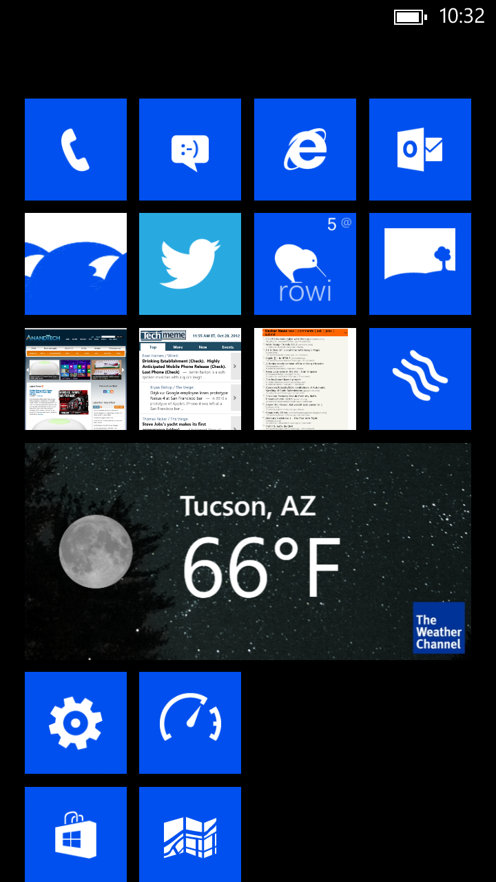
Small, Medium, Large Live Tile Sizes
The other huge change is the inclusion of a new smaller live tile size. WP7 previously had two live tile sizes, a single and double width size. The new smaller size splits the single wide size into a 2x2 grid. The end result is a fundamentally different start screen grid appearance in WP8 and WP7.8. Adding the smaller size is a definite improvement that results in a much needed increase in informational density without sacrificing too much of what made the start screen on WP7 so striking.
Applications can expose different live app information on the live tiles depending on which of the three tile sizes has been selected. The smallest size ends up usually just being a shortcut for a lot of third party apps, but Microsoft has done a good job not sacrificing too much at the smallest live tile size for their first party apps. Apps that haven’t updated to support WP8 yet only expose the smallest and single wide sizes, which are mandatory. Only newer apps can expose the double wide size from what I’ve encountered, and that size is actually optional.
Lock Screen
Another big user-facing change is to the lock screen, which now allows for much more customization. Previously the lock screen would show upcoming calendar events at the bottom in a detailed view, in WP8 this now can be changed to reflect either unread messages, emails, or even metadata from applications that talk through an API. There’s a list under the lock screen settings page which lists the available options. The background on the lock screen similarly can be customized by applications or remain set to just a static image.
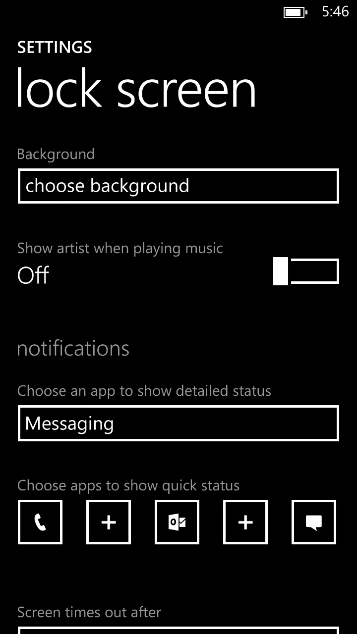
At bottom are also five smaller tabs which can show statuses as well, for example the number of missed calls, unread messages or emails. These can also show data from third party applications. The result is more customization for the lock screen which previously was relatively immutable besides the calendar detail information at the bottom. There’s another change to the unlock PIN workflow as well which forces the user to enter a phrase upon final password entry attempt. The goal there is to lessen accidental device wiping if you’re quickly typing the PIN but getting a key wrong.
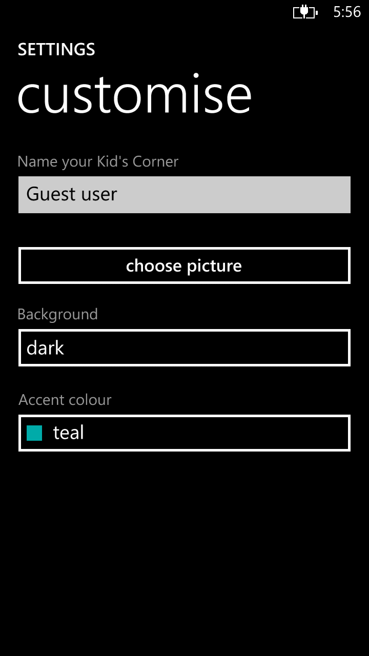
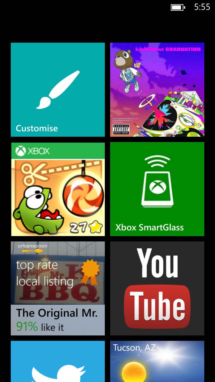
Along the lines of the lock screen is another new feature which has been dubbed “Kid’s Corner.” In reality kid’s corner is more of a guest’s corner, and is a rough approximation of multiuser support for smartphones. You can basically guess what this is — device owners can granularly select apps, videos, photos, and music that can be accessed in the guest view, which gets its own theme and start screen layout. This can be launched by sliding the lock screen to the left rather than up. The goal is to have a small walled garden of content and applications on the phone for use either by a child or guest, and prevent embarrassing email replies or tampering. Again, I view this more as a realistic mitigation for prankster friends changing their contact details, texting others as me, though the kid-access perspective makes sense as well.
Unfortunately the actual implementation lacks a guest account sandbox for applications, which is what it really needs to be a true multiuser approximation. At present, if you grant access to a particular application, the user data sandbox goes along with it, meaning if I tick the box for Twitter, the credentials go along with it. What is nice is that links to the browser don’t include the address bar, which does help prevent escaping the walled garden somewhat.
Maps
Apple and Google aren’t the only one implementing vector maps this refresh, and in WP8 Bing Maps gets an update which leverages some of Nokia’s own mapping infrastructure and expertise. The new maps application again includes vector streets, points of interest, labels, and assets. In aerial view the streets remain vector and get overlaid atop the aerial photography.
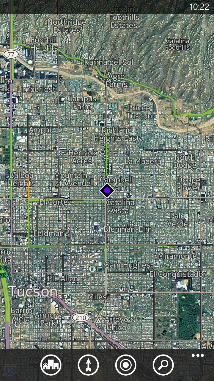
The application is consistently performant and Nokia’s considerable GIS experience really helps out here. In addition the new application adds the ability to cache map assets offline by region or country.
Improvements to the Hubs
One of the major original differentiators for Windows Phone was the concept of hubs — a number of applications designed to bring together various workflows under one easy to understand roof. Each successive update to the platform has brought steady improvements to those hubs, and this wouldn’t be an update without more of that happening. The People hub gets tweaked with the addition of two major new features, Groups and Rooms.
With Groups, you can create a custom list of people to follow and view details about. This is the mitigation for how sometimes the People tab would cause everyone to get lost in the background noise with so many updates and details from everyone in your contacts list. I created a small group with friends and it works as expected, essentially creating a smaller filtered view.
Rooms is an entirely new concept that leverages a number of Microsoft products. Rooms is an invitation-only space for a group of people to chat with each other, share a calendar, and share photos. A room concept could be a family sharing information back and forth with their schedules and photos. My initial concern was that functionality would be limited only to WP8, but Rooms also works with other platforms as well. Chat works using a special tunneled version of MSN messenger under the hood, but the other two are relatively painless — calendar exposes itself as CalDAV, and the shared photo album works through SkyDrive. Other platforms basically browse and interact through the web.


95 Comments
View All Comments
Chaser - Tuesday, October 30, 2012 - link
Maybe in your iSheep blinded fanboi eyes. Try looking at Android for 10 minutes next time before you broadcast your ignorance again.Sabresiberian - Tuesday, October 30, 2012 - link
I have a friend in the cell phone business (so he gets to try out lots of phones), he told me "Get a Nokia 920." He likes the Windows phone much better than an Android one.I might just do that. Then again, I might wait, because I'm still not seeing the bleeding edge phones with Windows on them. This, in my opinion, is one of the biggest factors that has held Microsoft OS phones back from the beginning. After the Win 7 phones came out there were some nice phones released, but "nice" isn't what I want, and I think I speak for a lot of people - we want the best smart phone we can get, and if it's Android then most people will buy it because it's a better phone, OS is secondary.
I mean, of all the phones I've seen reviewed here, the Note II looks like the best fit for me - but I want a Windows phone, so where does that leave me?
Still waiting, that's where.
;)
karasaj - Tuesday, October 30, 2012 - link
Well the hardware is basically identical. The best hardware out right now is the S4 (or the A6) with S4 pro just barely on the horizon and Tegra 4 months away. Windows phone has that. A lot of the flagship windows phones have their own things too. HTC has an amplifier for sound, and a never been done 2.1? (or 2.0?) MP front facing wide camera. Nokia has an insane (and also never been done except by them) 8.7MP camera that is WAY ahead of other phones. And wireless charging.But those innovations might not mean much to you depending on how much you use your phone. I'm interested in the 8X because I skype a lot, but the Lumia sounds nice because of Nokia's apps, as well as the charging (interesting) and the camera (insanely good). They're definitely innovative, but "best hardware" is subjective. The underlying SoC is the same, but some of the software/other parts of the hardware are really what makes the difference.
Dorek - Friday, November 2, 2012 - link
The 920 is bleeding edge hardware. The camera is an evolutionary leap above other smartphone cameras.wrack - Tuesday, October 30, 2012 - link
Does WP8 have orientation lock setting? I hate it when the screen rotates when I am reading news on the bed lying on side.karocage - Tuesday, October 30, 2012 - link
I thought it was interesting that you say there was a lot of debate about removing the "unused space" on WP7's home screen, because as is obvious to anyone who thinks about it for 5 seconds, that empty space allows you to see more items simultaneously than you can on WP8.Of course, the smaller tile size means you can see more items on WP8, but WP7 layout + WP8 smaller tiles size would maximize information density. The symmetry must be purely for marketing as seemed to be implied. Too bad. Less distinctive and less functional.
von Krupp - Tuesday, October 30, 2012 - link
Also less intuitive. There is no arrow to tell new Windows Phone users that more is to be had with a swipe to the left (or a tap on said arrow). If they wanted to better utilize that black space, they could have added charms for such items as search or settings, things that would actually get used often enough to warrant such a position.I do not like the new Start Screen at all, let alone the overall lack of change to the UI. Too many missed opportunities.
dagamer34 - Tuesday, October 30, 2012 - link
The arrow shows up when you scroll to the bottom.von Krupp - Wednesday, October 31, 2012 - link
In that case, I stand corrected on the "intuitive" part regarding the home screen.Still, I feel it lacks the character of the original.
Having put some more thought into it from the last post, I feel like a better use of the black area would have been charms representing programs running in the background...almost like the jump-lists from desktop Windows 7. Inside of an application, dragging the ellipsis would not only bring up the host of options, but the side bar as well.
Larger tiles just seems like a wasted opportunity. Almost lazily so.
jamyryals - Wednesday, October 31, 2012 - link
Larger tiles? The large tile and medium tiles were both in WP7. The new tile is the small one.The new home screen is better.