Three Months with Microsoft's Office 365
by Vivek Gowri on January 31, 2013 11:59 PM EST- Posted in
- Microsoft
- Cloud Computing
- Office 2013
- SkyDrive
Windows and Office. It’s a duo that has made up the core of Microsoft’s business since before I was born, and remains the cornerstone upon which the rest of the company is built. And so it has gone, for as long as I can remember: with each new version of Windows, a refreshed edition of Office to go along with it.

This year, we’ve got Office 2013. We’ve obviously had some experience with it in Windows RT form, and I spent a fair amount of time using the Office 15 Consumer Preview last year (in fact, I wrote my Masters thesis in Word 2013 Preview). In the grand scheme of things, it’s a pretty major change, with the biggest probably being the move towards a subscription-based model, though you can still buy Office in a traditional retail boxed edition with a standalone license. There are four different options for the standalone version of Office 2013: Home & Student (Word, Excel, PowerPoint, OneNote, $139.99), Home & Business (adds Outlook, $219.99), Professional (adds Publisher and Access, $399.99), and a volume-channel only Professional Plus with InfoPath and Lync for large businesses.

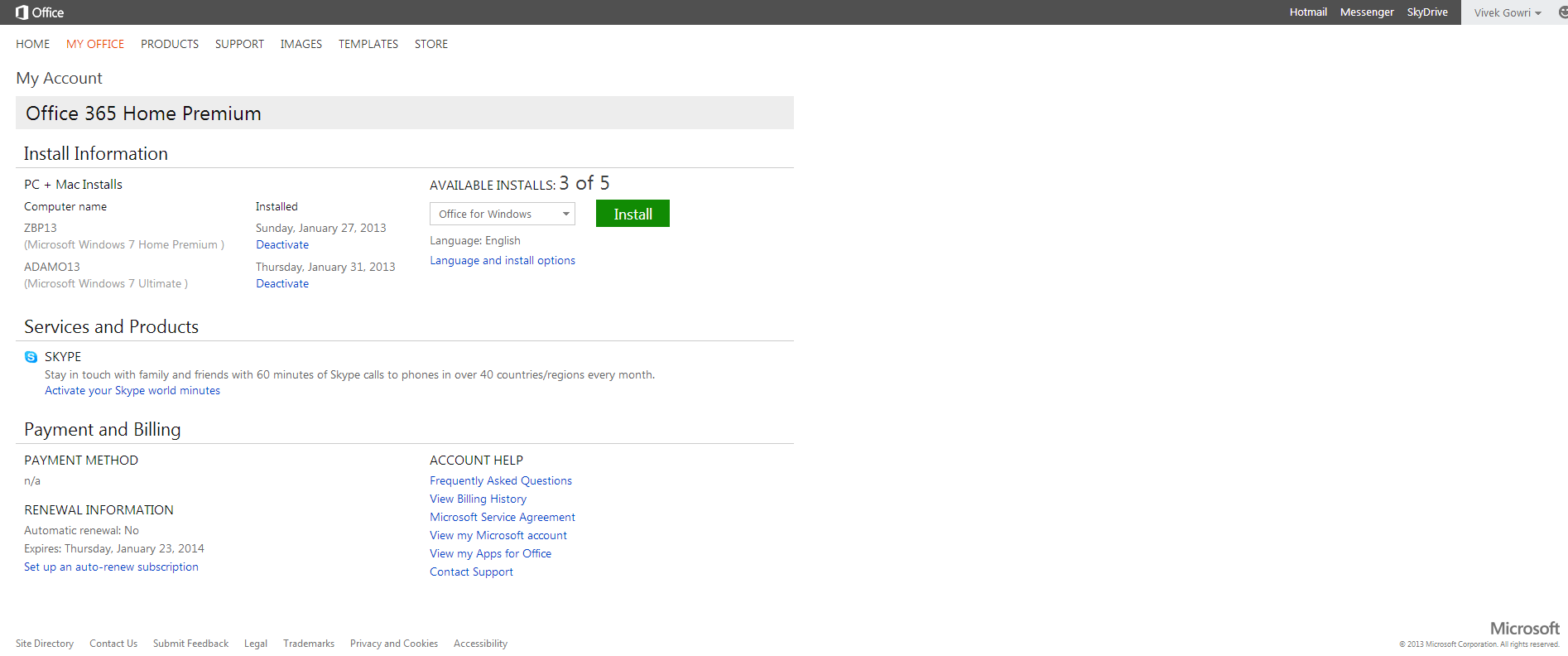
The interesting part is Office 365, which involves paying on a yearly basis for multi-device licensing and cloud storage. It’s worth clarifying the naming scheme here: Office 2013 refers to the latest version of the Office suite, while Office 365 refers to a subscription service that provides Office 2013 applications. Office 365 Home Premium and Office 365 University both come with the same set of programs (Word, Excel, PowerPoint, OneNote, Outlook, Publisher, Access) along with 20GB of SkyDrive storage, 60 Skype minutes, and multiple device installations (5 for 365HP, 2 for 365U). It’s a pretty sleek system, with all of Microsoft’s cloud services leveraged to provide a seamless experience. Obviously, this isn’t the first time we’re seeing cloud-based document storage and backup, but the SkyDrive integration in Office 365 is much deeper than we’ve seen in the past.
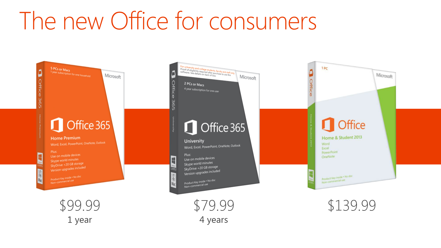
Now, with a subscription model, pricing is obviously key. I think Home Premium’s yearly $99.99 fee is a bit ambitious, but the University edition at $79.99 for four years is actually a pretty great deal. The only downer with 365U is that it only has support for two device installs, as opposed to five with Home Premium, but that’s the price you pay for getting an 80% discount. A university ID is, naturally, required at the time of purchase. (Thank god that most of my friends are still undergrads.)
| Office 2013 - Consumer Editions | |||||
| Variants | Office 365 Home Premium | Office 365 University | Office Home and Student 2013 | ||
| Price | $99.99 | $79.99 | $139.99 | ||
| Subscription Time | 1 year | 4 years | - | ||
| Device Installs | 5 | 2 | 1 | ||
| SkyDrive Storage | Free + 20GB | Free + 20GB | Free (7GB) | ||
| Skype World Calling | 60 mins | 60 mins | - | ||
| Office Programs | Word, Excel, PowerPoint, OneNote, Outlook | Word, Excel, PowerPoint, OneNote, Outlook | Word, Excel, PowerPoint, OneNote | ||
Let’s focus on Home Premium for now, as it’s the version that we’re testing and also the most relevant consumer product in the entire Office 2013/365 lineup. At $99/year, it offers a lot of value if you’re planning on using it on 4-5 devices, but if you’re only putting it on one or two devices, that sounds a bit steep. If it were in the $50-80 per year range with two or three licenses included and additional device installs available for $10 each or so, that’d be much easier. This also eliminates the problem for users wanting to install it on more than 5 computers. As presently constituted, to get more than 5 device installs, you need to buy another Office 365 subscription using a different Microsoft ID. With a typical family of four, it’s not even that difficult to think of having more than 5 computers, even if my occupation makes my household collection of computers a bit of an exception. Basically, it’d be nice to see a bit more flexibility in the plan with regards to the number of licenses available, along with this being reflected in the pricing scheme.
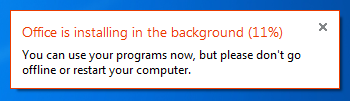
Setup is painless, with a simple executable (or .dmg for Mac installs) downloaded after creating or signing in with a Microsoft ID and entering your serial number. There is no DVD-based install, that has been retired in favor of purely digital distribution. The awesome thing here is that you can start using Office applications almost immediately, with many of the installation tasks being pushed to the background. Compared to the lengthy Office installs of old, this is a vast improvement.


113 Comments
View All Comments
Wolfpup - Thursday, March 7, 2013 - link
Right. Just because somethings the "in" thing to do doesn't mean it makes sense. We have shadows and the like FOR A REASON. It wasn't random, it's to give visual indication of what's clickable, what's on top of what, etc. Taking that away in the service of this year's "style" is inane.guidryp - Friday, February 1, 2013 - link
Color isn't needless crap.Monochrome icons make things harder to discover. I find that I have to look at them longer to identify them. We are only talking seconds, but it is evident that they are less ergonomic.
The flat monochromatic looks is like the early 1990's all over again.
We suffered through that once, no need to do it again.
Microsoft current UI changes suck.
It is bad enough they are forcing Metro on us, but they are also trying to make all their traditional UI's look flat a featureless as well.
name99 - Friday, February 1, 2013 - link
Wow! It's obvious designers have learned NOTHING from the 20th century.100 years after Mies van der Rohe, fifty years after Jane Jacobs and Cabrini-Green and we still have this bizarre "Fsck you, public. We are the designers, we know style, you stupid ignorant opinions mean nothing to us." attitude.
Did people prefer cutting out the "needless crap" of modernist architecture? Was the "machine for living" REALLY more efficient? Yes, Villa Tugendhat, to take one example, looks nice in a photo. But is it ACTUALLY a house you want to live in? Especially taking into account the massive cost to build it, then the massive cost to maintain it (turns out flat roofs leak horribly in a wet climate --- who would have though? turns out glass, especially 1930s glass, doesn't hold heat well in a cold climate --- who'd have thought?).
Have you NO humility man? Are you not the slightest interested in the possibility that perhaps usability matters to people more than pure aesthetics? Are you completely unaware of the historical parallels to your current unbridled arrogance?
steven75 - Sunday, February 3, 2013 - link
You can seriously look at that Outlook screenshot and tell me with a straight face its not a complete chaotic mess?steven75 - Sunday, February 3, 2013 - link
And comparing a website to something like Outlook makes it clear you have no idea what the difference is between a tool (Outlook) and content you passively read like a website.ThePegasi - Thursday, February 7, 2013 - link
How you managed to navigate to this article, let alone type and post a response, is somewhat baffling if all you do is read websites rather than interact with them. Many websites are just as much a tool as Outlook. You use navigation buttons, and even menus, and also read content (whether it be web content or an email). App-style interaction is very common on newer websites (which are the ones we're talking about if the discussion is around the most recent approaches to web design).Tams80 - Friday, February 8, 2013 - link
This website isn't too bad. The Verge on the other hand, that would be a better analogy; i.e. bleurgh!!! (to the people you seem to be trying to preach to).There was no need for Microsoft to not have an option for us to use the older UI, it wouldn't have changed functionality. With what's happened with W8 though, that was never going to happen.
ThePegasi - Thursday, February 7, 2013 - link
Just to be clear, I don't necessarily agree with all the assertions he/she made, but I felt that this particular distinction you made was worth addressing.cyberguyz - Monday, February 4, 2013 - link
Looks like MS Office (and by extension Win 8) was designed by people just like you friend - designers that Just Don't Get It. The whole freaking lot of you should be fired and replaced by 5-year-olds armed with crayons. They couldn't do any worse.I have Office 2013 co-installed with Office 2010 (the 2013 was a freebie upgrade for me) on one of my systems. Y'know what? Outlook 2013 looks so bad that I will just not use it. Guess which MS Office I do use on a regular basis.
Office and Windows may be just dandy feature-wise, but if Microsoft insists on following this butt-ugly UI course there are on, they have seen the last dime of profit they will be making from me. I am voting with my wallet just as all other paying consumers are voting with theirs. Judging from Microsoft's profit reports, I have a pretty good idea how that vote is going.
Murloc - Friday, February 1, 2013 - link
I have to agree with B3an, it's us people becoming older and being nostalgic of old-fashioned stuff.All the design is going in this direction althoguh I like windows 7 aero style more, but I understand that it's old fashioned and I'm behaving like an old woman who keeps wearing clothes that were fashionable in the 50s because it's just what she's used to.
We have to get over it. Colorful icons look too busy and cheap for todays' standards.
In a few years when someone sees a shiny design similar to windows 7, he will say:
"hey the 00s called....".