Three Months with Microsoft's Office 365
by Vivek Gowri on January 31, 2013 11:59 PM EST- Posted in
- Microsoft
- Cloud Computing
- Office 2013
- SkyDrive
Generally, Office 2013 works pretty similar to Office 2010, with an interface heavily reliant on the ribbons. Now, I’ve always been a fan of the ribbons, which I thought were a good idea in Office 2007 but really came into their own with Office 2010. It’s been six years since they debuted, so anyone that is still complaining about Ribbon UI should really get over it, especially now that Windows Explorer uses it as well.
The aesthetic has been updated to match the Metro visual style that forms the basis of the Windows 8 and Windows Phone 8 UIs. This visual style has left me a bit cold in Windows 8 Desktop - I like the UI chrome in Windows 7, I feel it gives the interface some three-dimensionality and offers more natural interactions. But in Office, the chromeless aesthetic is awesome. I think it works really, really well in Word and PowerPoint especially, where the starkness and simplicity of the UI (particularly in the hidden command or hidden Ribbon modes) gives you a very blank slate to work from. It’s clean and pure in a very fundamental sense, with no visual distractions at all in the UI.
I’ll also note that the refreshed interface has little to no effect on Excel, which has looked and felt exactly the same since I first used it in Office 97 as a five year old. It’s like the Porsche 911 - no matter what changes under the hood, externally it has looked the same for decades it seems like. Not that it’s a bad thing, since I love the 911 and love-hate Excel, but it’s worth mentioning nonetheless.
Generally, it seems like the Office 2013 has a much stronger focus on the visual style of the content being created than I’ve noticed in previous editions of Office. There’s much more aesthetic polish, with rich templates that aren’t worthless like they have been in many previous editions of Office, nicely styled titles and headers, and many more document design capabilities. Until you use it, it’s really difficult to overstate how much cleaner documents that come out of Office 2013 look. It’s now much easier to create content that are visually pleasing - documents and presentations that just look good and are easy to read without needing to spend a ton of time on formatting.
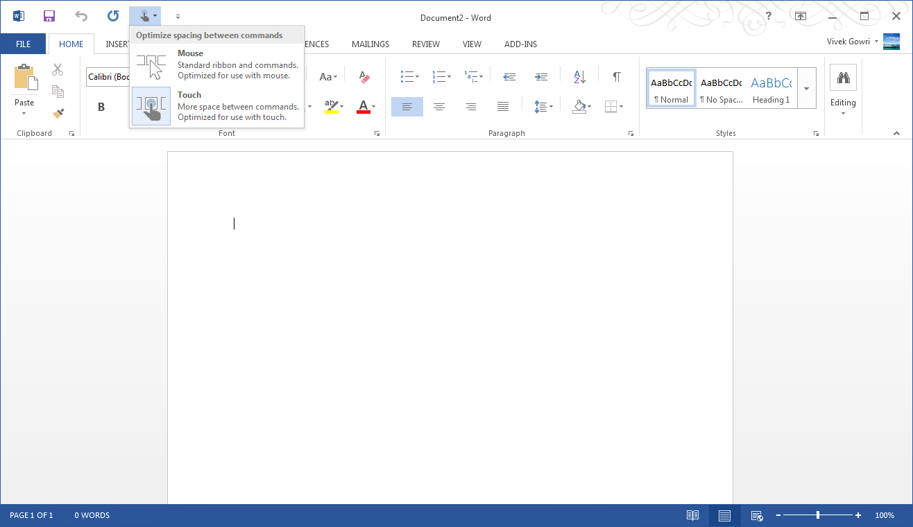
Microsoft is including two input modes: mouse (Office as we know and love it) and touch, which expands the size and spacing between menu options for a more finger-friendly interface without dumbing it down. Look closely at the below screenshot versus the one at the top of the page to get an idea of what I'm talking about. It’s decent to use, but obviously, creating content using the touchscreen keyboard is an outright pain, so this is more for navigation, minor editing, and formatting changes. You will obviously get more out of any office suite with a traditional keyboard and mouse setup, but the new Office at least has a more touch-centric UI as an option.


113 Comments
View All Comments
Wolfpup - Thursday, March 7, 2013 - link
Right. Just because somethings the "in" thing to do doesn't mean it makes sense. We have shadows and the like FOR A REASON. It wasn't random, it's to give visual indication of what's clickable, what's on top of what, etc. Taking that away in the service of this year's "style" is inane.guidryp - Friday, February 1, 2013 - link
Color isn't needless crap.Monochrome icons make things harder to discover. I find that I have to look at them longer to identify them. We are only talking seconds, but it is evident that they are less ergonomic.
The flat monochromatic looks is like the early 1990's all over again.
We suffered through that once, no need to do it again.
Microsoft current UI changes suck.
It is bad enough they are forcing Metro on us, but they are also trying to make all their traditional UI's look flat a featureless as well.
name99 - Friday, February 1, 2013 - link
Wow! It's obvious designers have learned NOTHING from the 20th century.100 years after Mies van der Rohe, fifty years after Jane Jacobs and Cabrini-Green and we still have this bizarre "Fsck you, public. We are the designers, we know style, you stupid ignorant opinions mean nothing to us." attitude.
Did people prefer cutting out the "needless crap" of modernist architecture? Was the "machine for living" REALLY more efficient? Yes, Villa Tugendhat, to take one example, looks nice in a photo. But is it ACTUALLY a house you want to live in? Especially taking into account the massive cost to build it, then the massive cost to maintain it (turns out flat roofs leak horribly in a wet climate --- who would have though? turns out glass, especially 1930s glass, doesn't hold heat well in a cold climate --- who'd have thought?).
Have you NO humility man? Are you not the slightest interested in the possibility that perhaps usability matters to people more than pure aesthetics? Are you completely unaware of the historical parallels to your current unbridled arrogance?
steven75 - Sunday, February 3, 2013 - link
You can seriously look at that Outlook screenshot and tell me with a straight face its not a complete chaotic mess?steven75 - Sunday, February 3, 2013 - link
And comparing a website to something like Outlook makes it clear you have no idea what the difference is between a tool (Outlook) and content you passively read like a website.ThePegasi - Thursday, February 7, 2013 - link
How you managed to navigate to this article, let alone type and post a response, is somewhat baffling if all you do is read websites rather than interact with them. Many websites are just as much a tool as Outlook. You use navigation buttons, and even menus, and also read content (whether it be web content or an email). App-style interaction is very common on newer websites (which are the ones we're talking about if the discussion is around the most recent approaches to web design).Tams80 - Friday, February 8, 2013 - link
This website isn't too bad. The Verge on the other hand, that would be a better analogy; i.e. bleurgh!!! (to the people you seem to be trying to preach to).There was no need for Microsoft to not have an option for us to use the older UI, it wouldn't have changed functionality. With what's happened with W8 though, that was never going to happen.
ThePegasi - Thursday, February 7, 2013 - link
Just to be clear, I don't necessarily agree with all the assertions he/she made, but I felt that this particular distinction you made was worth addressing.cyberguyz - Monday, February 4, 2013 - link
Looks like MS Office (and by extension Win 8) was designed by people just like you friend - designers that Just Don't Get It. The whole freaking lot of you should be fired and replaced by 5-year-olds armed with crayons. They couldn't do any worse.I have Office 2013 co-installed with Office 2010 (the 2013 was a freebie upgrade for me) on one of my systems. Y'know what? Outlook 2013 looks so bad that I will just not use it. Guess which MS Office I do use on a regular basis.
Office and Windows may be just dandy feature-wise, but if Microsoft insists on following this butt-ugly UI course there are on, they have seen the last dime of profit they will be making from me. I am voting with my wallet just as all other paying consumers are voting with theirs. Judging from Microsoft's profit reports, I have a pretty good idea how that vote is going.
Murloc - Friday, February 1, 2013 - link
I have to agree with B3an, it's us people becoming older and being nostalgic of old-fashioned stuff.All the design is going in this direction althoguh I like windows 7 aero style more, but I understand that it's old fashioned and I'm behaving like an old woman who keeps wearing clothes that were fashionable in the 50s because it's just what she's used to.
We have to get over it. Colorful icons look too busy and cheap for todays' standards.
In a few years when someone sees a shiny design similar to windows 7, he will say:
"hey the 00s called....".