Windows 10 Build 10159 Released To Windows Insiders
by Brett Howse on June 30, 2015 10:30 PM EST- Posted in
- Operating Systems
- Windows
- Microsoft
- Windows 10
Just yesterday, Microsoft released build 10158 to the Windows Insiders fast ring. I was going to write it up but I wanted to kick the tires on it first to give my thoughts to the changes. Normally there is plenty of time to do that, but today yet another build was released. Build 10159 comes today, and once again just to the fast ring, so if you need an ISO you’ll have to wait a bit for this build to come to the slow ring.
A few months ago, I really questioned whether Windows 10 would be ready by summer. When Microsoft announced that the launch date was July 29th, it seemed like an enormous task to refine the OS to a point where it would be ready for the public. But the last couple of builds have made some pretty big strides in stability and polish, and now, with less than thirty days to go, it does seem possible.
Of course with that being said, this release of Windows is going to be unlike any previous one. Not only is there a major push by Microsoft to have people upgrade, but many of the core features of the OS have been pulled out and moved to the Windows Store so that they can be updated through that mechanism over time. There will be a lot of features coming to Windows 10 that have been shown that are not going to make it on day one, so for those that want access early, be sure to keep in the Windows Insider program which will continue after launch and let you get first access to some of the new features, and be able to provide feedback.
For those that wonder if that feedback is being heard, it sure seems like it is. On the previous build, 10130, there was a new animation for file copies and downloads where the icon would fill from the bottom in white, rather than the horizontal fill in green that has been around for a while now, however with 10158 it has been reverted to the old way due to customer feedback. There have been a lot of these kinds of changes that have been driven by the community and it is certainly a much different take on developing Windows than the Steven Sinofsky era which lead to Windows 8.

So with that preamble out of the way, let’s take a look at some of the new changes to build 10158 and 10159. With less than thirty days to go, major features are taking the backseat to bug fixes and polish.

The first big change is that Project Spartan has finally been replaced with the official Microsoft Edge browser. The official name was given out at Build in April, but all builds to this point have still kept the codename for the browser and its icon. That now changes and along with a new icon the browser brings quite a few more features forward. The settings now have more than just a couple of minor tweaks, and you can now make a lot of changes to the behaviour of the browser. On startup, you can choose from a Start tab, New Tab, Previous Tabs, or Specific Tabs. The New Tab page can also be customised to include Top Sites, Top Sites with Recommended Content, or a blank page. I’ve been using Top Sites with Recommended Content since 10130, and while I would appreciate a way to customise the content more, I do quite like what is presented there through MSN. You can also toggle a home button option, and import favorites from another browser. Edge can also be toggled to use a dark theme, and it finally gains support for passwords and form fills. I know it’s pre-release software, but it has sure been a pain that it never remembers passwords. It still really needs extension support however that is not coming until after launch.
Cortana also gains some more features such as flight tracking – something that already exists in Cortana on the phone – and it is also gaining integration with Office 365 in order to keep track of your schedule. You can also send an email with Cortana using natural language, and this is something I want to try out however Cortana is still not active in Canada. It must be our crazy accents.
The Photos app has been one of the big improvements pretty much since Windows 10 was first shown, and in 10158 it continues to get performance and bug fixes, and they have now added GIF support which was apparently one of the top requests.

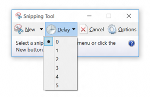
One smart addition is that the snipping tool now has an optional delay to allow you to capture menus. I have always used Windows Key + PrtScn to capture those in the past but then you need to crop out what you need so this is a nice little bonus.
Today’s build of 10159 adds over 300 fixes according to Microsoft, and it also changes the login screen to include the new Hero wallpaper that Microsoft has created for Windows 10. You can also pick that wallpaper in the settings, as well as have the secondary colors be picked from the image you have as your wallpaper.
It may seems like there is not a lot of substance with the latest builds, but I really have to say the stability and polish has come a long way. I was having issues on previous builds with the new Mail and Calendar apps, and those are now working flawlessly. The notifications seemed like they did not always work, and now they work consistently. App crashes have come down quite a bit, and since installing 10158 and now 10159 there are a lot less quirks to deal with. With a month to go, it now seems like they are going to get there. More will come after the fact, but the core OS seems like it just might be ready to be installed on the 1.5 billion Windows devices.
Source: Windows Blog


51 Comments
View All Comments
dgingeri - Wednesday, July 1, 2015 - link
It's a good build, and it solves some issues I've seen, but my system will still not engage the screen saver, turn off the screen, or go to sleep from inactivity. It just stays on all the time. I can't figure out what does it, but these things work when it is first installed, and then quit working after the first reboot.tipoo - Wednesday, July 1, 2015 - link
Cool wallpaper. Exporer icons still ugly, I hope that's not final.robertjm - Wednesday, July 1, 2015 - link
The L2TP/IPSec VPN type is still messed up. There is no place to enter the Shared Secret, which is a required field (even if you leave it blank).This should be fixed before release as PPTP has been hacked, and some Black Hatters are boasting a 100% success rate at cracking it.
Martin84a - Wednesday, July 1, 2015 - link
I just hope Windows 10 fixes that damn monitor ID issue that is present in Windows 7 and Windows 8. I am sick of tired of having my TV being the #1 display, no matter what I do.brkkab123 - Wednesday, July 1, 2015 - link
Not worth installing. Seriously buggy and screwed up my dual-boot pc. I uninstalled/formatted ssd it was on. So far, Windows 10 isn't a worthy upgrade for any Windows 7 or 8.1 pc. Every 10 build since the January conference on it, has gotten worse. Not better.Hairs_ - Wednesday, July 1, 2015 - link
I have to say, I was massively disappointed after all the hype of the Build conference.While it's certainly less neurotic and incoherent than 8 in some areas, it's still very, very ugly, and very, very badly thought out. From the build conference, you might have expected that some of the fundamentals of Windows were being dragged out of the 80's, with Modern Unified apps, DX12, Cortana, etc etc etc.... the trouble is that as far as I can see none of those things are actually working.
The Windows app store might be up and running, but there's nothing but junk in it (have a search for "twitter" and see how many 3rd party apps there are....). There might be a Unified version of Office but anyone using excel for anything other than the basics isn't going to be impressed.
Performance is still shonky, and DX12 still isn't ready for launch. There are fundamental parts of the system, like text flow within a window, or disappearing scroll bars, or huge blank spaces where there needs to be information, or at least context.
As for the design.... it's terrible. Truly terrible. Not only are they not living up to their promise to have a "single UI" across all the possible devices, they haven't even been able to have a single UI on a desktop device. Instead of scrapping old UI elements, dialogs and whatnot, they're just putting a white rectangle in front of them. They're actually adding to the number of different layers now. Windows is like an archaeological dig at this point, you can see things from every era from DOS onwards. What's galling is that where they have put in a new UI, it's almost universally less functional, less legible, less useful and less intuitive. There are parts where I honestly cannot understand the information flow. Going into "settings" feels like you need a rope and some breadcrumbs. It was actually a relief the other day to get dumped into the Win7 Network and Sharing controls centre, because it actually made sense! Everything I needed to see was in one place.
It's the worst version of Windows I've ever used and I used 2.0 for a while. Truly awful.
Oxford Guy - Wednesday, July 1, 2015 - link
I'm surprised all the hype hasn't gotten to you. It seems people are so desperate after Windows 8 for any improvement that they're willing to think this ugly UI is still something special.Oxford Guy - Wednesday, July 1, 2015 - link
The Mac OS from the 80s had a great UI (with the exception of a few oddities like Chooser and Internet Config stuff), with the exception of placing too much focus on programs unlike the Lisa which was task-centric.The closest Microsoft has come to an elegant UI is Windows 95. Once 98 came around with its terrible "strap a web browser onto a window" nonsense the trend started of basically just increasing the complexity. There is so much redundancy in Windows 7 alone and Windows 10 looks worse and is even more of a hodgepodge.
Nibholm - Wednesday, July 1, 2015 - link
Upgrading to W10 basically means you go from user to product. Lots of uninstallable shovelware, ads, tracking of your use behaviour, forced updates/new shovelware and restrictions what you can do with your computer. Pro is bit better than Home Premium but most people will get latter.Seeb66 - Thursday, July 2, 2015 - link
Installed latest build of windows 10 this week and absolutely hated it. What the hell, it's even uglier than windows 8.- No window borders/frame
- A stupid white title bar for all legacy windows,
- Hideous close, maximise,minimise icons in the title bar (disproportional spacing, with no rollover effect)
- Awful skinny font for the windows title text
- icon design in file explorer alone makes me want to vomit
- don't even get me started on the new control panel (designed for children < 5)
I can't believe a graphic designer puts their name to this, aaaaargh it hurts my eyes.