The Windows RT Review
by Vivek Gowri & Anand Lal Shimpi on October 25, 2012 12:00 PM EST- Posted in
- Windows RT
- Operating Systems
- Microsoft
- Mobile
- Windows 8
- Tablets
First Party Applications
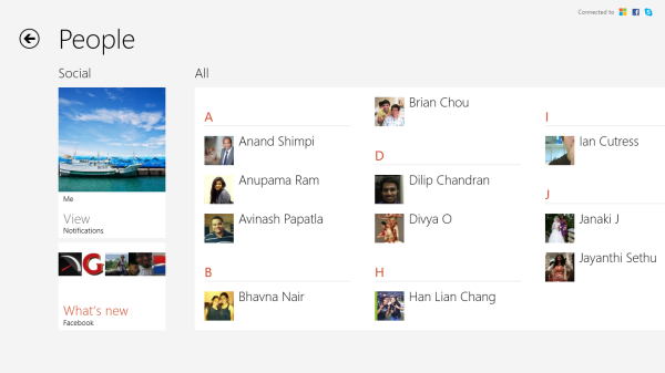
Microsoft has bundled in a healthy suite of first party applications for Modern UI, including obvious suspects like Internet Explorer, Mail, Calendar, People, Maps, Messaging, and Bing, as well as apps for things like news, finance, sports, weather, remote desktop, and media playback, amongst others.
There’s also a list of desktop applications that’s a little less heartening. The familiar old Windows Accessories are still sticking around, with favorites like Paint and Notepad joined here by the classic Remote Desktop Connection application, Snipping Tool (another holdover from the Windows Tablet PC days), the Math Input Panel, and XPS document viewer. Ease of access applications, too, are desktop-based, as are system functions like Control Panel, Command Prompt, File Explorer, Task Manager, and the Run dialog. Personally, I’m disappointed that there wasn’t a Modern UI version of Command Prompt because, let’s face it, how cool would that be?
You’ll note that I left out the headlining Windows RT application: Office 2013. It’s one of the most vital pieces to the Windows RT puzzle, so it demands a bit more context - I’ll get to it in a bit, after running through some of the more notable first party applications.
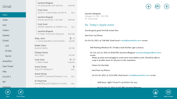
The mail application here is decent, with an ultra-spartan design and a straightforward 3-column layout. You get accounts and folders on the far right, a middle column with the sender, subject, and thread information. When you expand a multi-email thread, a message preview is also shown. Finally, in the main part of the window, the selected message is displayed. If you’ve used any recent version of Outlook or Hotmail, the layout and implementation should be instantly familiar except for the Metro visual style. Compose, reply, and delete are located in the top right corner of the email window, while mark as unread and move to folder are located in the bottom edge swipe bar.
As far as options go, there really isn't much to mess with - just the ability to turn off threaded messaging. You can connect any EAS, IMAP, or POP email accounts, with support for Hotmail, Gmail, Exchange, AOL, and Yahoo mail accounts built in already. For Gmail accounts, the delete button actually just archives things - to really delete mails, you need to move the message to the deleted folder.
Mail isn't Outlook, and usability is far from perfect. Manual syncing requires an edge gesture to reveal the sync button and there's no way to just tap on a sender's name and create a new email. There are other little issues like these that keep Mail from being a best in class tablet email client. Mail works, it just isn't great.
Calendar
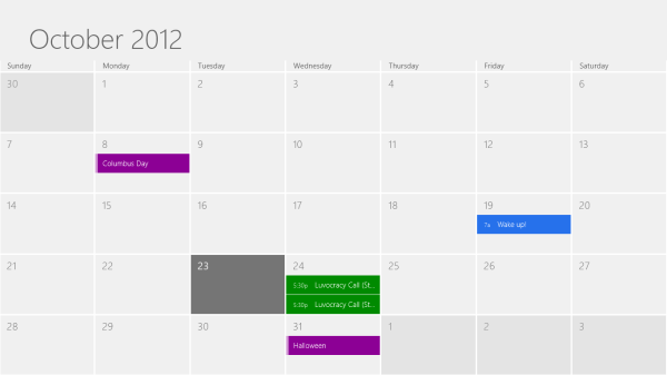
The calendar application is similarly focused - a very clean user interface with not too much power, but it does exactly what it needs to. It will sync to Hotmail, Google, and Outlook calendars, and I'm hoping that once there is a Facebook application, it will sync to that as well. You can pick between day, week, and monthly resolution from the bottom swipe menu, which is also where you add new calendar events. Options for adding new calendar events include date, time, length, location, repetition and reminders - the standard list. The UI is again very touch-centric, so trying to use the calendar with just the mouse is slightly frustrating since everything is hidden in the edge swipe bar. Thankfully, pressing or clicking on a particular day/time takes you directly to a new event creation page, which is pretty convenient. I like the way the calendar application operates, and the visual style is perfect for getting the information you need at a glance. Power users might find it lacking, but for basic tasks, it's more than adequate.
Messaging
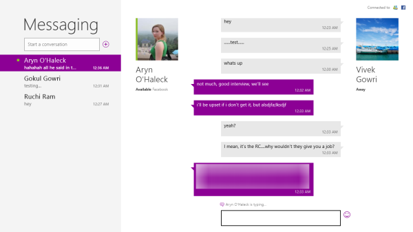
The messaging application is one that has so much potential, but needs more to really be useful unless you only use Live Messenger and Facebook Chat. Personally, given the Skype acquisition and the combining of the Windows and Skype IDs (I’ll get to this later, but basically when you login to Skype, your Windows ID is linked to your Skype ID), I feel like the Messaging app should either include Skype chat in it or somehow fuse Skype with the messaging protocols already in place. I personally rely on Google Talk, and in an ideal world it would be supported as well, but I won’t hold my breath.
Nobody I know has used Live Messenger since it stopped being MSN Messenger, so I reserved most of my testing for Facebook Chat. It’s a good looking chat interface, but using it full-screen is a total waste of display real-estate. Messenger is an application that lives for Windows 8 Snap, and it’s really the perfect app to show off that capability with. Finally, a tablet operating system that’s good for instant messaging.
Bing News, Sports, and Travel
There are a variety of Bing-based applications here - News, Sports, Travel, and of course, Bing itself. I personally don’t find too much point to the Bing search app, since if I’m already in the browser it’s much easier just to search from the URL bar.
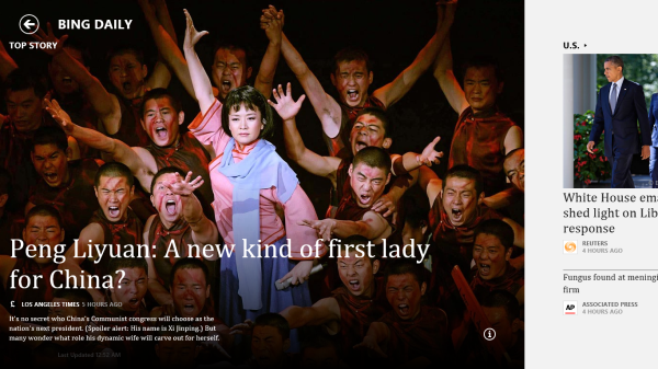
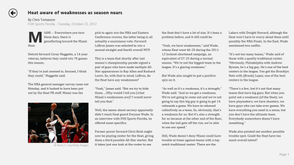
The other applications are somewhat interesting though. Sports and News are very similarly designed, so I’ll cover them together. Basically, there’s a top story that takes up most of the front page. You can horizontally scroll through a number of other headlines, aggregated from various news sources (Reuters, NYT, AP, etc) and separated by category - US, World, Technology, Business, etc. You can choose to browse the “Bing Daily” news, news specially targeted towards you, or pick from the list of sources to see each one individually. (My feed was full of technology news, wonder why.) Sports is essentially the same thing, except with the categories being sorted into the various sports. You can pick favorite teams, look at all the day’s sporting news or just the particular sport you want to see.
In either case, the articles are presented in a clean, easy to read format. For a one-stop-shop news source, it’s pretty decent. The overall treatment reminds me a bit of Flipboard a bit, while the articles themselves are displayed in a reading optimized context like Apple’s Reader mode in Safari. The treatment is obviously different - horizontal columns and page scrolling, but it’s a generally similar concept.
Bing Travel is a bit different - it has a list of popular destinations, and features numerous photos, maps, panoramas, list of attractions, hotels, restaurants, and guides for each city page. From the app, you can research the location, book flights and hotels, and use the application to guide your trip plan in terms of sites and restaurants to visit. Most big cities in each geographic region are listed, though smaller travel destinations are a bit harder to come by. I can see the app being really useful when on travel as a more convenient alternative to Yelp.





233 Comments
View All Comments
faizoff - Thursday, October 25, 2012 - link
I just got done fully reading the Surface review. This should be a good one as well.EnzoFX - Thursday, October 25, 2012 - link
Sure was.Win RT is promising, it really is all about the tablet experience. Which is why I don't understand their decision to have the desktop and access to all the underpinnings. Surely a real power user won't limit themseles to RT, and simply go for the 8?
Is it to have developers make desktop-centric arm based apps? That seems counter intuitive. They could have easily made Office into a Modern UI style app. What is the real point in the end? Maybe I missed something.
My only other criticism is little things that sometimes show me lack of focus. 4 edge swipes? Couldn't they have streamlined that down to 2 max? and why must some things just be too hidden, or even not even accessible via the Modern UI?
Leonick - Thursday, October 25, 2012 - link
"Is it to have developers make desktop-centric arm based apps? That seems counter intuitive. They could have easily made Office into a Modern UI style app. What is the real point in the end? Maybe I missed something."Considering developers can't make desktop apps for Windows RT that isnt it...
I'm guessing MS was simply too lazy or "didn't have time" to build a metro equivalent for everything for Windows 8 and will likely continue the work for the next release, as long as the desktop is still there they could also put Office even on RT with minimal effort.
But yea, it's odd.
blanarahul - Thursday, October 25, 2012 - link
I am really interested in seeing Windows RT with Quad Core Qualcomm S4 Pro. 40% faster CPU, 100% faster GPU than Tegra 3. Power friendly. It should make RT shine even more. In fact I believe that the APQ8064 was made for Windows RT.karasaj - Friday, October 26, 2012 - link
This is exactly what I was thinking and hoping Surface would have come out with.Krysto - Thursday, October 25, 2012 - link
"The odds of that situation arising seem relatively low, so my bet is that the strength of the ecosystem will be a non-issue a month from now."Really? A month from now? Can I hold you to that? It will be at least a year before Metro store gets even tens of thousands of apps. I think you've been reading too many Microsoft PR statements ready, and it's starting to influence your objectivity, and now you're just using Microsoft's words as your own - while thinking to yourself that they are your own words.
StevoLincolnite - Thursday, October 25, 2012 - link
Right... Because you're really going to browse and install 10's of thousands of Apps. (With the majority being fart of flashlight apps anyway.)munsie - Thursday, October 25, 2012 - link
So when it was Windows vs Macs back in the 90s, the argument was always that there were more apps on Windows, why would you buy anything else? But now that there are more iOS apps vs Win RT apps, it's that most of them are "fart of flashflight apps"?More apps isn't just more junky apps -- it means that more experimentation/innovation is happening as well. It means that there are apps being built for the long tail, not just the mass market appeal. Think about apps targeting very specific users, like doctors, lawyers, engineers, etc. These apps aren't the ones you see at the top of the charts, but are the ones that sell platforms.
Microsoft more than any other company should understand what Apple has accomplished with the iOS App Store.
andrewaggb - Thursday, October 25, 2012 - link
Yes and no though. Developer tools are much better than they were in the 90's.Many of these apps are already cross platform with ios and andriod, and many others already have windows versions or silverlight/wp8/xbox 360 versions that can be ported much easier.
Many of the popular dev tools used by smaller/indie developers already support exporting to different platforms, so if they don't support windows 8 yet, they will soon enough.
Plus Visual Studio is great.
Not to say Apple's accomplishments aren't amazing, they are. Nobody could have envisioned the success they've had in such a short time.
Apps will come. There's no money to be made right now anyways, nobody has devices, it'll all sort itself out in a few months. I think 1 month is optimistic, but within 6 months the apps will be there.
StormyParis - Thursday, October 25, 2012 - link
Well, the 90's argument was "1- why pay more 2- for slower, less expandable hardware that 3- is missing some key apps or even whole categories of apps and 4- is fading", so really, a series of issues.In the present case we get , 1- why pay the same or less 2- for slower, but a lot more expendable hardware that 3- has a killer app, though it's missing many key apps and all of the non-key ones but 4- will probably surge.
BTW... Google "75% Of Apple's App Store Is Ignored by Consumers" for a fun fact, if it is indeed true.