Three Months with Microsoft's Office 365
by Vivek Gowri on January 31, 2013 11:59 PM EST- Posted in
- Microsoft
- Cloud Computing
- Office 2013
- SkyDrive
Word 2013 has a couple of nice features worth calling out. One is a viewing mode designed specifically for reading, which is pretty similar in theory to Reader mode in Safari, with text reflowing in columns to fit the display and all navigation and editing tools being hidden to present the document in a consumption-centric manner. The other is much better handling of PDFs - Word 2013 can now open PDFs and treat most content (text, tablets, formatting) exactly the same as standard Word docs. If you’ve ever had to deal with the nightmare of copying content from PDFs to Word, this is wonderful news. Unfortunately, now I’m done with college; it’s unfortunate that Microsoft didn’t decide to implement this in Word 2007 when it would have been legitimately useful to me. (Sidenote: perhaps this is a sign that I’m getting old, but I’ve had a number of moments in the first month of this year when I see new tech products and think to myself “Damn, I would have killed for that 5 years ago when I was an undergrad.”)
PowerPoint comes with significantly better audio and video media support, the ability to add pictures from online directly to the presentation instead of having to save and insert them, a new presenter view when you have a second screen (which is done automatically), more (and better) themes, some cool new transitions (in a category called “Exciting”), and better sharing and editing tools.

Excel’s improvements are primarily related to new charting options, but also a couple of new data tools. The new chart object styles are awesome, and the customizability of the data point styles and transparencies is much easier than it used to be. Other than new content and the visual refresh, the way you interact with the software hasn’t fundamentally changed much with the added features, which is why I’m kind of glossing over Excel and PowerPoint. They’re evolutionary improvements that don’t radically alter the user experience.
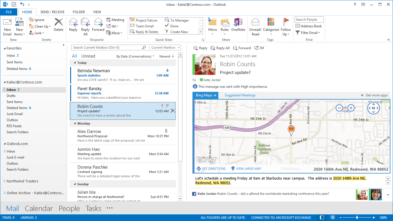
Outlook has been redesigned to look like a much more powerful version of the Windows 8 Mail application, with a colour scheme change from gold to blue. Inline replies are now the default, there are plenty of animations, and social networking integration is being touted as one of the more important new features. Clearly, this is not my father’s Outlook we’re talking about. It takes some of the better features from current mobile mail applications and integrates them into what was already the gold standard in desktop mail programs. There are new flyover boxes (called Peeks) to quickly show you schedule, calendar, or contact details without switching windows. The contact manager also does a better job of consolidating multiple contact details into a single card to reduce duplicates. Faster search, better filtering, and new views and in-line attachment and Bing map previews make the 2013 edition the sleekest and easiest version of Outlook yet. After using Outlook for a few days, going back to the Mail app is just a painful and torturous exercise.
With Office 2013, OneNote is making the jump from interesting and useful Office application to really being a vital component of the Office suite. With the rise of tablet computing and the touch-centric nature of Windows 8, this is understandable, particularly since most of the Intel-based tablets are coming with Wacom, N-Trig, or other active (pen-input) digitizers and even the Windows RT slates work well when paired with capacitive styli. That most Windows RT slates don’t come with capacitive pens out of the box is a failing of the device manufacturers, since the platform really lends itself to pen input.
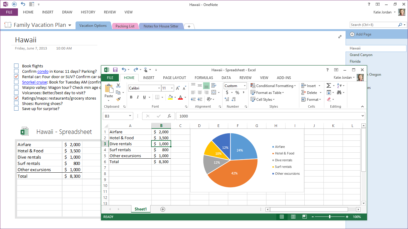
OneNote 2013 features a lot of cross platform integration, with easily embedded objects and Office files (which automatically update when changed). So, if I was to put an Excel grocery list file into OneNote, any changes I made to it in Excel would be reflected in OneNote as well. Outlook meeting integration gives OneNote much more scope in the business realm than it previously had, particularly when combined with the improved search and linked audio features. Better inking, photo snipping, auto-save, and a full-page reading view just improve what OneNote was already great for.


113 Comments
View All Comments
mevans336 - Friday, February 1, 2013 - link
What is it in?VivekGowri - Friday, February 1, 2013 - link
Mechanical Engineering. Already graduated actually, diploma is in the mail :)mevans336 - Friday, February 1, 2013 - link
Awesome, congratulations! What school?Samus - Saturday, February 2, 2013 - link
All my buddies (and myself) have ME degrees (I don't have a masters) and they have vast flexibility with employment. I've had jobs ranging from Ford to IT consulting. I did go back to school for an associates in EE, but its funny that none of us any longer have a typical ME job. One of us is a truck driver, lol!p05esto - Friday, February 1, 2013 - link
I really dislike the UI and graphical style of this and Win8. It's 2013 and the interface so totally boring, no color, no shading, no shadows, doesn't pop or anything. Why 1 color icons, can't we make things look nicer than this? Maybe it's a small thing, but it all looks cheap and uninspired, so cold and boring. No thanks to the Modern UI.B3an - Friday, February 1, 2013 - link
Yeah exactly, it's 2013. Not 2005.If you like dated graphic design, things like gradients, shadows, shiny icons, gloss, material emulation and pointless rounded corners then either go back to 2005 of use iOS or OSX.
Speaking as a designer i can safely say that pretty much all modern design is heading this way. Including site designs. Whenever you see a new design of a major site it's nearly always more Metro-ish looking. Thats because it's better, it's cleaner, it's more efficient, it focuses more on content not pointless chrome, it cuts out then needless crap and most people prefer it.
Wall Street - Friday, February 1, 2013 - link
But the UI is horrible. IT doesn't indicate what is clickable or not and has a poor use of white space. The best interfaces have a good user experience and build the aesthetic around that. Metro clearly had the aesthetic laid out before they made the interface.Murloc - Friday, February 1, 2013 - link
apart for the removal of gradients and juicy looking 3D icons, it's very similar to 2010.In 2010 you can see what is not clickable because it's greyed out. I guess it's the same in 2013.
The icon style changed but other than that there's really no difference in looks.
Murloc - Friday, February 1, 2013 - link
look at the copy button in the first image of the look and feel page: it's greyed out.Flunk - Friday, February 1, 2013 - link
Actually, it's very easy to tell what's clickable. Everything that's not the background color is clickable.Actually the Windows 8 UI uses far more color than the old interface did and it uses them for informative purposes, not just graphical bling. It's content over all else and functionally it's much better than the old 1990's style of psudo 3D everywhere which basically only tells you what you can and cannot click.