The iPhone 4 Redux: Analyzing Apple's iOS 4.0.1 Signal Fix & Antenna Issue
by Brian Klug & Anand Lal Shimpi on July 15, 2010 12:28 PM EST- Posted in
- Smartphones
- Apple
- iOS 4
- iPhone 4
- Mobile
In case you haven’t noticed, the iPhone 4’s antenna design has come under considerable scrutiny. In our iPhone 4 review, we investigated the iPhone 4 antenna and came to two conclusions. First, that iOS 4 was displaying signal bars in an overly optimistic manner, compressing the dynamic range of possible signal bars users can see. Second, we identified a worst case signal drop of around 24 dB when the iPhone 4 is cupped tightly in the left hand, covering the black strip and possibly detuning the antennas and adding additional attenuation from the presence of the hand.
Since those initial measurements, we’ve been working tirelessly to both characterize the problem, fully understand the mechanisms behind it, and report on a number of possible solutions.
The Bars Have Changed
On July 2, Apple released a letter noting that the formula used in iOS 4.0 to calculate how many bars are presented for each signal strength is “totally wrong.” This mirrored our conclusions that the effects of the signal drop were exacerbated in part by the way the iPhone visualizes signal strength - the dynamic range is compressed so much that the 24 dB drop from cupping the phone without a case could make all the bars go away.
They went on to promise that in a future software update they would make bars 1, 2, and 3 taller, and make the bars more “accurate” by displaying 2 bars fewer in certain circumstances.
iOS 4.1 beta rolled around yesterday, and we immediately dove in to find out just how much the bar to signal strength mapping has changed. Update: iOS 4.0.1 final just came out this afternoon and we finished preliminary testing. The signal strength mapping algorithms are identical to the 4.1 beta. The findings in this article apply to 4.0.1 as well as the 4.1 beta.
After updating our devices to the iOS 4.1 beta (and 4.0.1) and making sure our little trick to show signal strength in dBm instead of bars still worked, we set off. Remember last time how I said I drove around town all day with iOS 4.0, testing the phone, and recording signal strength and how many bars were being shown? You guessed it - another update, another evening of driving around. Anand and I did quite our fair share of moving around to get a complete picture of what the new cutoffs are.
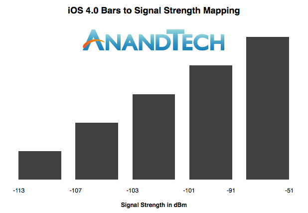
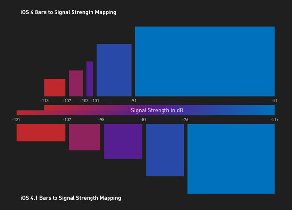
Old Bars
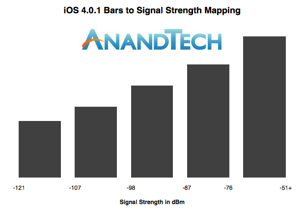
New Bars
The results are conclusive - Apple has dramatically changed the signal strength to signal bar mapping in iOS 4.0.1 and the iOS 4.1 beta, making the dynamic range not only much broader, but the range values for each bar much wider. The range of signals that correspond to bars three and four are the same width, and bar two is only slightly less.
The cutoff value for two bars to one bar remains the same, but every other value has increased. The result is that the worst case drop of 24 dBm no longer makes all the signal bars disappear, but rather two.
AnandTech reader Mike Escoffery, Director of Design and User Experience at Media Platforms, created his own diagram to help compare the old and new way of iOS signal strength reporting:
As you can see the old way (top) put far too much weight into the 5th bar of signal. Apple's new approach not only splits it up more reasonably between the 4th and 5th bar (still non-linearly keeping you in the 5th bar if possible) but also extends the range of the lower bars.
This change actually presented itself in our numeric signal strength reports - there’s more dynamic range in these numbers too. Previously, the absolute lowest value any iPhone would report was -113 dBm. With iOS 4.0.1/4.1, the value is now a shockingly low -121 dBm. In the iPhone 4 review, I talked a lot about how although the phone is prone to dropping signal from being held wrong, it was measurably more sensitive in weak signal areas. I was shocked that calls and data worked seemingly unfazed at -113 dBm. It seems as though this increased 8 dBm of range below -113 dBm was meant to show really how much more sensitive the radio stack is - it undeniably is more sensitive. Both Anand and I were able to hang onto calls all the way down at -121 dBm.
We’ve also included a comparison to how the latest version of Android displays signal bars from GSM or UMTS networks below. Thankfully, this didn’t require driving around town all day but rather inspecting the latest version of the Android source code from Google’s own repositories. Android uses an ASU value to compute signal strength, which isn’t anything more than a remapping of dBm to a sane value that’s a bit easier to interpret.
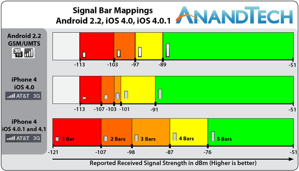
Apple’s mappings have gone from having probably the most compressed dynamic range among handset vendors to less compressed than Android.
While the software update obviously does not and cannot address the design of the antenna itself - or make the drop from holding the phone any less - it does change the way the issue is perceived among users. The result is that most iPhone users will see fewer bars disappear when they hold the iPhone 4 in a bare hand. The side effect is that the iPhone now displays fewer bars in most places, and users that haven’t been reporting signal in dBm will time see the - perhaps a bit shocking - reality of locations previously denoted as having excellent signal.
Interestingly enough, Apple has indeed changed the heights of bars 1, 2, and 3. They’re taller, and the result is that the relative heights are no longer linear, but rather a tad exponential looking. It’s a mind trick that Apple no doubt hopes will make the signal look better. If the bars are taller, they must denote stronger signal, right?
From top to bottom: iOS 4.1, iOS 4.0, Android 2.2
The reality is that Apple likely wants to deflect at least some of the initial backlash AT&T will face for reporting the signal bars without any concessions. Concessions that used to make coverage look better than it really is. Regardless of how tall the bars are, there are still going to be fewer of them virtually everywhere. Interestingly enough, while bars 1 and 2 are the most changed, their respective cutoffs are virtually unchanged.
While I was testing iOS 4.0.1, I told Anand that the signal reporting lie that started with the iPhone 3G had been removed entirely. That iOS 4.0.1 would potentially show the reality of AT&T’s coverage to iPhone users. With 4.0.1 users looking at signal bars will get a much more realistic view of how signal is changing.
We tested the iOS 4.1 beta on iPhone 3GSes as well, and found the mappings to be the same there as well.


146 Comments
View All Comments
mfenn - Thursday, July 15, 2010 - link
Brian,Can you update the article with the exact part # or a link to that Kapton in the appropriate width?
Brian Klug - Thursday, July 15, 2010 - link
Hey mfenn,Updated the article with a link and specifics about the tape. I also discovered that what I thought was 5 mil thick tape is the 1 mil thick Kapton - still an amazing insulator though.
I didn't buy it online however, rather got it somewhere else locally. I don't know whether you can find that exact size online, but you can definitely cut it.
-Brian
Stokestack - Thursday, July 15, 2010 - link
And maybe elaborate on why you think the new system is more accurate, considering that (in a digital system) a large range of signal strength does give you "full service".Shouldn't a phone show full bars for the entire range of signal strength that gives you totally effective performance? At the weak end is where you see performance variation, so that's where the bars should vary as well.
What's the point of showing differing numbers of bars through a range that doesn't change the phone's performance?
lunarx3dfx - Thursday, July 15, 2010 - link
The difference, is that rf and digital are two totally different beasts. RF is like nothing you'll ever learn about. I have to deal with it a lot in the work that I do, and while a shift from -117 to -81 doesn't seem like that much, for every 3 dbm gain or loss, you are doubling or halving your signal strength (in wattage), but it still isn't that simple, for example a 10dbm signal will be expressed as 10 mW signal strength, a 20dbm signal will be 100 mW. You can't compare RF with anything else. It is it's own world.rushbc - Saturday, July 17, 2010 - link
i understand about the RF energy being different than anything, it really is its own world (i know, i work for AT&T).but i think stokestack has a good point. if -94 dBm gives you great service and good speed for voice/data, then the end user shouldn't care if the display shows one bar or ten bars--their phone is working, transferring data and voice with no issues. so a large dynamic range of signal strength that shows the end user 5 bars does make sense. five bars simply indicates that you have enough signal to do what you need to do, and your device has enough signal to do what it needs to do.
but since i do work for AT&T, and since i have talked to AT&T customers, i know that they DO care about the bars. i cannot tell you how many times people will tell me, "hey, i am only getting one bar on my cell phone at my office".
and i say, "well, can you make and receive calls?"
and they say, "Yes".
then i say, "well, can you connect to the internet on your phone without any problems?"
and they say, "Yes".
then i say, "well, what is the problem, then, sir?"
then they say, "but i am only getting one bar!" then i just smile to myself and try not to scream. it's almost like the famous old "who's on first" routine, but in real life.
so i predict many users will be confused by the "new" bars. and some will be angry. but Apple is doing the right thing by displaying the "more correct" signal bars. honesty really is the best policy.
Apple should really bite the bullet and completely ditch the whole bars thing.
it would be another way for Apple to show great leadership, bravery, and innovation. lets just get rid of the silly bars, totally. we need Apple to just go with strict numerical dBm readout. sure people will be confused. sure people will complain. sure there will be a learning curve. but it would be a quick adjustment. and within two years every smartphone in the world would be doing the same thing with numerical readouts in dBm, not bars.
it's called "standardization" (something completely lacking in signal strength indicators for wireless devices), and it would help the industry, and educate the consumers, and probably improve the wireless networks ability to respond to coverage needs and customer requests for network improvement. it would certainly help wireless consumers better understand how strong or weak their signal really is, and it could help people adjust their expectations accordingly.
"Death to the Bars!"
bring on the transparency of dBm numerical readouts on handset displays, i say.
Disclaimer: I am an AT&T customer and an iPhone owner. I am also an AT&T employee. I do NOT receive any form of compensation for my posts. My posts reflect my own personal opinions and do not necessarily represent AT&T’s positions, strategies or opinions. I also do not possess any "insider knowledge" of future products or future releases. And if I did, I certainly wouldn't tell you! :)
anandreader - Sunday, July 18, 2010 - link
"I just smile to myself and try not to scream..."
You're not listening to your customers. What they're telling you is that when the signal is weak, the voice quality is very poor. They may not be articulate enough to say that to you but that's the message that's being sent. You're just so fucking self-satisfied with your little syllogism that you're failing to hear the message. At&t's signal is crap in too many locations.
Your attitude clearly illustrates why people detest At&t.
thisma - Wednesday, July 21, 2010 - link
Anandreader, I suspect that rushbc's interpretation is accurate.Occasionally a user will have a real problem but describe it using some idea which is quite remote from the actual problem. I find, however, a good match in my comparison between rushbc's statements and how I expect users do express themselves.
My applicable knowledge, about how people communicate and what concerns users, has been developed during my several years of professionally teaching people how to use technology including, among other things, computers, phones, audio and video equipment, and all manner of peripherals.
oPad - Friday, July 23, 2010 - link
Wait a minute, it sounds like rushbc asked if there's anything wrong other than the bar strength display and they said "no",What's to articulate?
thisma - Wednesday, July 21, 2010 - link
Rushbc, I would love that! I fear however that the most prevalent perspective of users is that they don't care about precision of truth until they understand what that precision means. Even then a 5 bar display is so easy to interpret that a person doesn't even have to consciously check the indicator; if it's low you'll notice that out of the corner of your eye. My preference would be to have both the same way, perhaps, as you can optionally have the battery life indicator shown with the percentage of battery life next to it.bigboxes - Saturday, July 17, 2010 - link
Sound waves act very similar.